
I don’t know if it is just being deep into our Canadian winter, or the fact that a lot of my artwork is created in black-and-white, but sometimes I crave color like one craves sugar.
 So, at the beginning of the year, I took out my colored inks and mucked about. One of my favorite colors is blue. I love any shade of it. So, this day, without really knowing what I was going to make, I decided to do some monoprinting on cards.
Monoprinting — if you’ve not heard of it — is simply applying ink to a flat surface, then making marks in the ink with brushes, q-tips, pencils, your fingers….really anything will work. Then, you lay the paper on the surface and pull one print (thus ‘mono’). This print is truly one-of-a-kind because the marks made are unique and cannot be reproduced by hand again.

This day, I used both my brayer (roller) to leave geometrical patterns on the block, as well as a stiff bristle brush to make designs.

The designs started to look like mountains (where did that come from? LOL). I just kept applying ink and pulling prints.

The best thing about this was that it was colorful free-play. I love having no agenda! If they didn’t turn out, no matter. Soon, I had a satisfying row of cards hanging to dry.

After about a week, and sitting with the funky designs in blue, I thought it would be cool to add a silhouette of trees in the foreground. The ‘mountain shape’ was really hinted at, but I liked the strong outline of the forest over the blue sky. Using a small roller to ink the trees, I line the block up by hand and over-print the blue cards.

 Voila! Monoprinted greeting cards. I’ve called this one “Mystical Forest” because of the swirly sky and the shards of light that could be sun coming through a cloud or the shape of the mountains. What do you see?
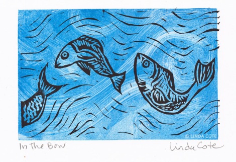
Previously, I have made monoprinted cards of both fish swimming in the Bow River, and one of my best sellers: my Midnight Mountains card.
 And, if you wish, come into the studio to see the process! My YouTube video shows me hand-printing the ‘Midnight Mountains’ greeting cards:

The textured with these prints are amazing! Love the blues!
Thanks so much Trish! It’s great fun to play with color like this!
I think I would like to try this.
You should! So much fun!
Loved the little film
Thanks for watching the video Paul! A picture is sometimes worth a thousand words, no?
Sure is! It was a well made little film,might try it myself but will need to read my camera instruction book well first and then look at how to edit.Could be some time.
Reblogged this on artbykcp.
Thanks for the reblog! Appreciate you sharing my processes!
Love this so much!!
Thanks Katina! Nice to catch up with you here! Thanks for reading the blog!
Very nice. I can see mono printing bringing a fresh element to printmaking. I think the cards look lovely.
Thanks,Deb! It’s really fun playing with monoprints, and I’d love to do lots more. Takes me outside the world of lines!
It is good to try something new. I switched from canvas to panel a short time ago and it completely freed up my painting.
The prints are gorgeous and what fun and so interesting to watch you work! Thanks for sharing, Johanna
Aw, thanks Johanna! I love seeing your work as well!
Linda your pieces are so much fun, I have done a bit with my adults with special needs and they are making cards to sell,so the soft block would be a nice edition to the mono print. Thanks for sharing.
So happy to share, Kelly! It’s the best thing when someone takes some inspiration from what I am doing. Thanks for letting me know!
Pingback: Gelli printing and playing with color | Musings From The Studio·
these prints really inspired me alot, these are so so so amazing, these prints just cleared my mindset about what’s mono printing; but only thing i wanted to know is that what kind of ink or colours can we use for this printing
Hi Yukta, I use a special paint for these gelli prints: “Open Acrylic” or “Fluid Acrylics” made by Golden, so the color does not dry very fast. That way, you can work on the gelli plate for a few minutes before pulling the print. If you use traditional acrylics, they dry so fast, you won’t get a good print. Thanks for your question and comment!